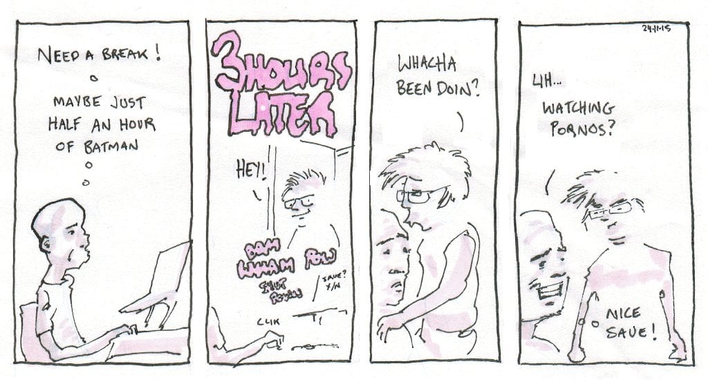
- 1st November- Shovel Knight
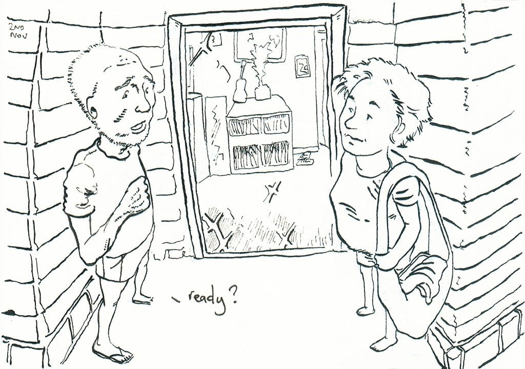
- 2nd November- Leaving home ain’t easy
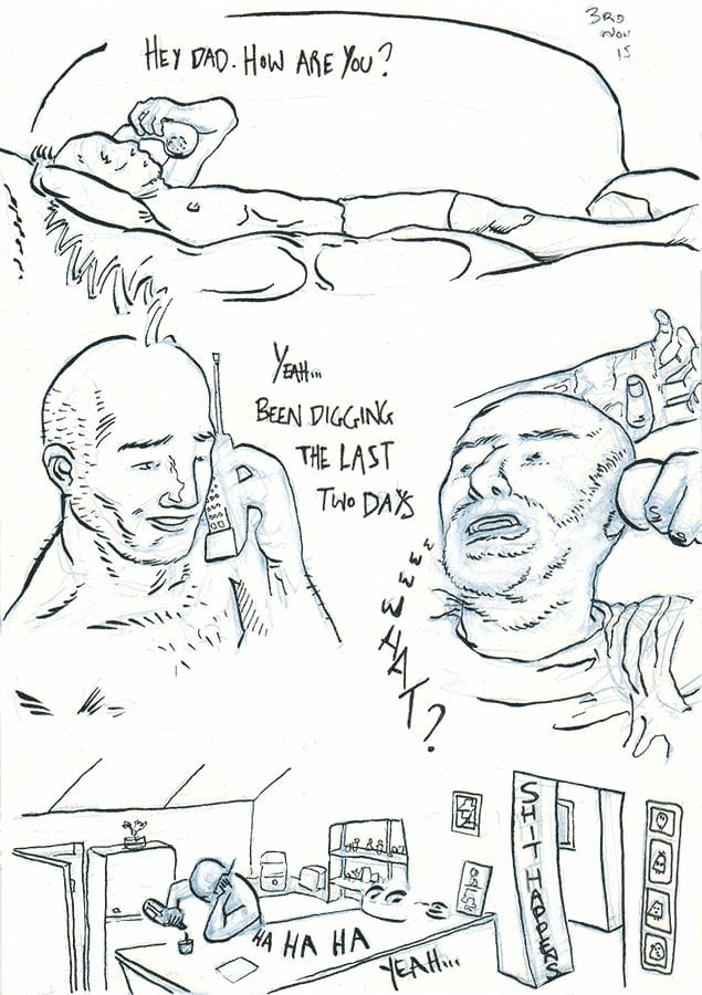
- 3rd November- Some machines run on ethanol
- 4th November- In living colour
I think this is the first digital paint of a diary comic I’ve done for a while. I’m pretty happy with the left foot and the ear. The rest needs more work but I don’t have the time, so you will have to forgive me. Definitely fun though, I’ll probably do some more full colour diary comics soon. Thanks to Chloe Walsh for her top digital painting tips.
- 5th November- 20/20 hindsight

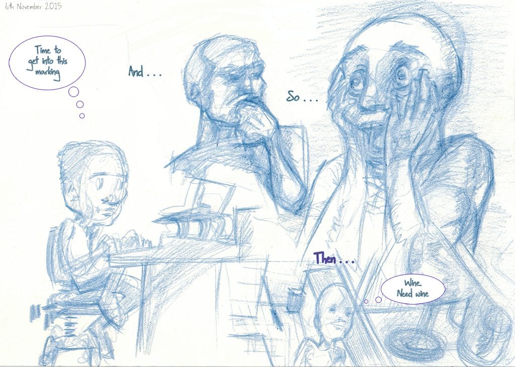
- 6th November- I mark, therefore I drunk
- 7th November- Couch with a view
- 8th november- The Art of Zen
- 9th November- Breathe in relaxation, breathe out stress
- 10th November- Please become an expert in this persons area of research by the end of the day
- 11th November- E-bike versus single speed. No contest
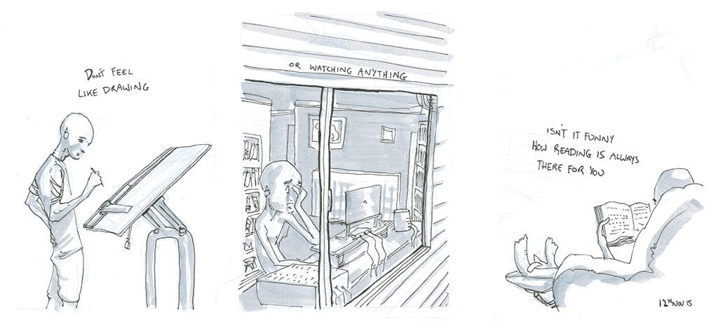
- 12th November- Simple pleasures
- 8th-12th November- Keeping it loose
I’ve been thinking lately that I need to pull back on the amount of time I’m spending on diary-comics, and this is the result. A quick initial pass with blue pencil for layout and general forms, and straight in with the 0.3 copic ink pen onto bleedproof paper. No messing about thickening up lineweights or thinking about solid blacks. No ruling up of perspective grids, sticking to loose, minimal backgrounds, and working gesturally without much thought. As a result this took me a quarter of the time I would normally have spent. It’s hard to pull the pin so early into the process, but working in this way means I’ll be able to stay on target. Which right now is quite important!
- Friday the 13th- Bathing with new friends
- 14th November- Visit from the folks
This is a fun process, although not quite the time saver I thought it’d be. No filters applied, the nice effect is courtesy of saving as a 16 colour PNG. For anyone concerned, the spider babies are fine, only a few were washed out. The rest have migrated throughout the house and will keep us company for the summer.
- 15th November- Meditemptation
- 16th November- White middle class empathy
- 17th November- IT and the Infinite Sadness
- 18th November- Love in Lycra
- 19th November- Cave dwellers
- 20th November- Freedom fighter
- 15th-20th November- Efficiency measures
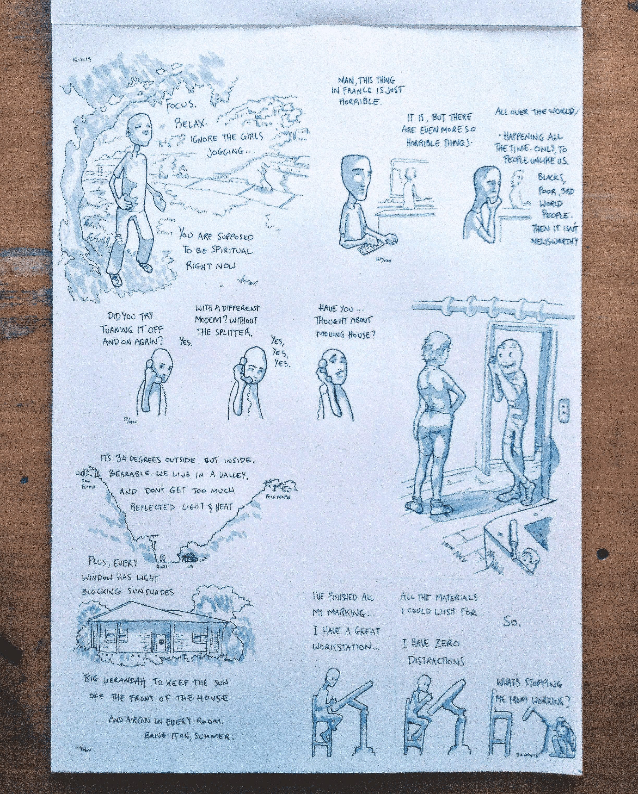
 For this page of diary comics I’ve taken a similar approach as the last time, except here after roughs with a blue pencil I’ve gone straight in with a 0.5 ink pen, focusing mainly on key lines. Once these were established I put in text, deciding to go straight in without planning, which resulted in the need for fix-ups in Photoshop. If one thing needs to be planned, it’s text. After this I went over the lot very quickly with a Neutral Gray copic marker and finished up with a 0.3 and 0.05 for some finer details. I tried to keep this one quite simple, which is not easy for me, as I’m prone to getting carried away with detail. Although the linework is a little too thick in some areas, this one was completed quite quickly and I’m happy with the result.
 - 21st November- Theory of irrelevantivity
- 22nd November- Naked in front of the computer
- 23rd November- Stormy, stormy night
- 21st-23rd November- Process review
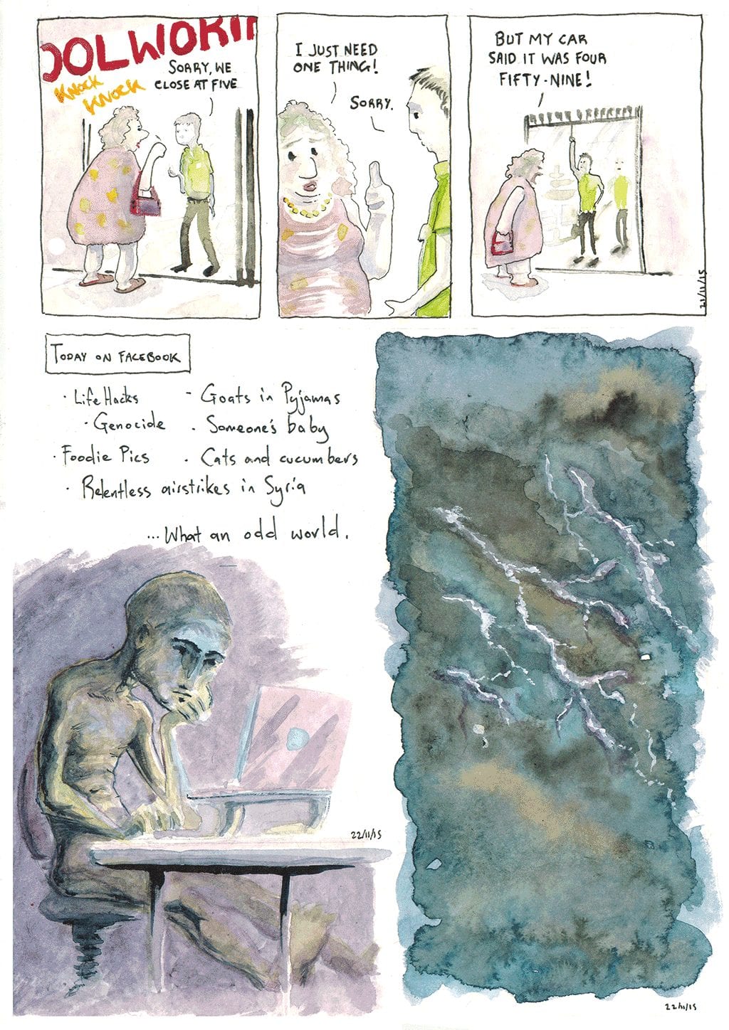
Back to watercolours for this page. In mixing up materials and styles I’m trying to not only improve on my weak spots, but also maintain my ongoing interest in this project.
What did I learn here?
- 21st- Subtle, faint washes do not reproduce in scans. At least, not on my scanner. Process of graphite pencil for layout, then watercolours, then a thin (0.2) line over the top.
- 22nd- Here I went a lot darker and tried to really floosen up my application of colour, washing a dark purple hue over the legs and in the shadowed area with no idea how it would dry. I didn’t consider the light source very well and its a bit of a mess as a result. I found that the watercolours dry much lighter than they appear wet, which improves my confidence of really attacking dark areas in future. Text was put in at the last-minute and taken out afterwards in Photoshop, as it wasn’t well thought out and let down the piece as a result.
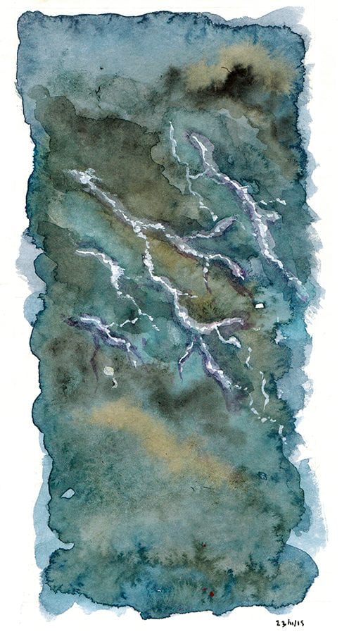
- 23rd- Painting a stormy scene. I watched a couple of watercolour tutorials online and everyone seems to have a different approach, so I just disregarded the lot and went for it. I tried to get it dark but once agin it dried much lighter than anticipated. Mixing in some burnt umber was a nice touch, and balanced the hues a little, giving some contrast/complement. I messed up the lightning by making it purple, but managed to save it with a bit of gouache.
- It’s just a constant process of trial and error; doing something, ruining it, saving it, ruining it and saving it again. My tolerance for how badly I can mess up my work is improving!
- 24th November- Guilty pleasures
- 25th November- Voluntear it up
- 26th November- It’s all you
- 28th November- Irrefutable truths
- 27th November- The horse whisperer
- 29th November- In the zone
- 24th – 29th November- Fast and loose

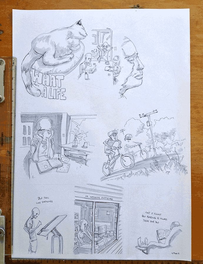
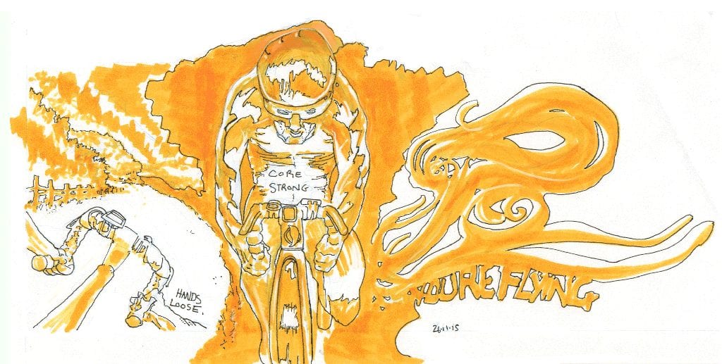
This allotment of diary comics was put together on A3 Bleedproof paper using a range of Copic markers. Process was blue line layout, then in with the Copics, then loose lines using one or two different ink pens over the top (except for the asshole strip where i also used a brush pen). The focus here was speed, and not worrying about the final result too much. Using the chisel edge of the copic marker in a gestural manner before application of final ink line resulted in a few happy accidents here and there, as the marker dictated lines and shapes I wouldn’t have thought of but had to go with. I’m particularly happy with some aspects of the cycling comic, and the minimalistic lines of the first and last comic on the page. Being fast means I don’t worry so much about making a pleasing image. It’s about clarity and guiding the eye. Aesthetics takes a back seat for now.
- 30th November- Meetiquette
- 30th November – 3rd December- Process

Last week I bought an A4 pad of Canson Illustration 250gsm paper. It’s packaging is targeted towards comic artists and illustrators. I found it quite nice to draw on, smooth and strong with a faint texture that catches and holds wet media. This piece is a mix of black and blue ink and ink washes, using crow quill pen and a couple of different brushes, mainly a great little thin sable hair brush that seems to be able to do most things. I went quite dark in this one to avoid the washing out effect of the scanner, and kept the lines quite simple and gestural. Going for speed and trying not to be precious here, which seems to be a major focus at the moment. Must be the deadline on my Doctorate looming! This page took between two and three hours from start to finish, which took place in a few stints over two days. I’m happy with the second strip, middle panel, where some areas I left white on the characters gave a nice dappled light effect I can use in future.

