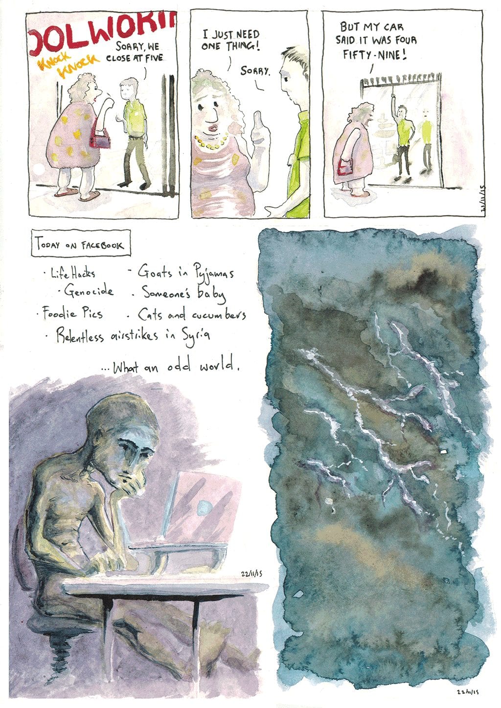
Back to watercolours for this page. In mixing up materials and styles I’m trying to not only improve on my weak spots, but also maintain my ongoing interest in this project.
What did I learn here?
- 21st- Subtle, faint washes do not reproduce in scans. At least, not on my scanner. Process of graphite pencil for layout, then watercolours, then a thin (0.2) line over the top.
- 22nd- Here I went a lot darker and tried to really floosen up my application of colour, washing a dark purple hue over the legs and in the shadowed area with no idea how it would dry. I didn’t consider the light source very well and its a bit of a mess as a result. I found that the watercolours dry much lighter than they appear wet, which improves my confidence of really attacking dark areas in future. Text was put in at the last-minute and taken out afterwards in Photoshop, as it wasn’t well thought out and let down the piece as a result.
- 23rd- Painting a stormy scene. I watched a couple of watercolour tutorials online and everyone seems to have a different approach, so I just disregarded the lot and went for it. I tried to get it dark but once agin it dried much lighter than anticipated. Mixing in some burnt umber was a nice touch, and balanced the hues a little, giving some contrast/complement. I messed up the lightning by making it purple, but managed to save it with a bit of gouache.
- It’s just a constant process of trial and error; doing something, ruining it, saving it, ruining it and saving it again. My tolerance for how badly I can mess up my work is improving!
